Thoughtfully curated for the good of humanity
Cosmos
FONTS
Cosmos is like stepping into the dream archive of the internet’s most stylish creatives. It’s part mood board, part visual mixtape—where artists, designers, and tastemakers curate collections that surprise, inspire, and sometimes totally rewire your brain. The design is clean and quiet, letting the imagery do all the talking—and wow, the images. Strange, beautiful, unexpected stuff you won’t find on your average inspo scroll. It’s less like browsing and more like exploring someone’s beautifully organized imagination.
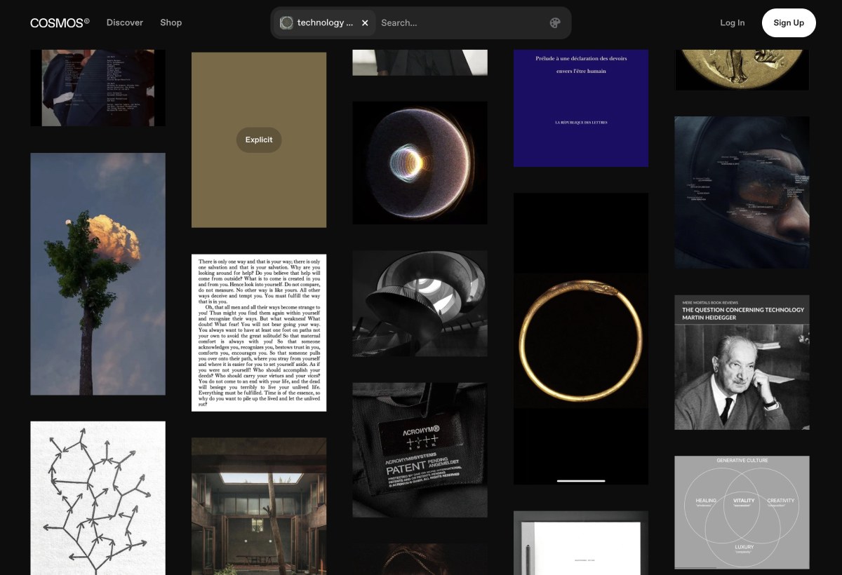
From an AI designer and creative's perspective, @charming_computer is a masterclass in cohesive, speculative worldbuilding. Each post feels like a still from a film that doesn’t exist yet—but should. Using AI tools with precision and restraint, the account weaves together a consistent visual language of retro-futurism, brutalist environments, and emotionally charged sci-fi aesthetics. The color palettes are muted and cinematic, the characters feel grounded in narrative, and the details—whether in wardrobe, architecture, or atmosphere—build a believable, immersive universe. It’s not just prompt art; it’s visual storytelling with intent, taste, and a clear directorial voice.
London Short
Film Festival
FONTS
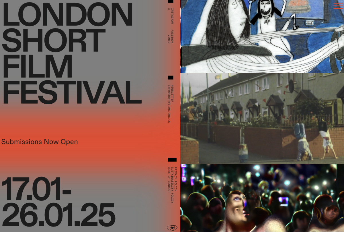
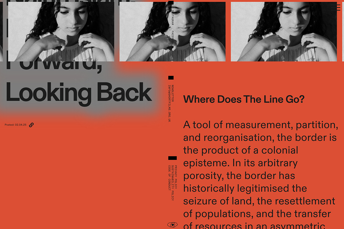
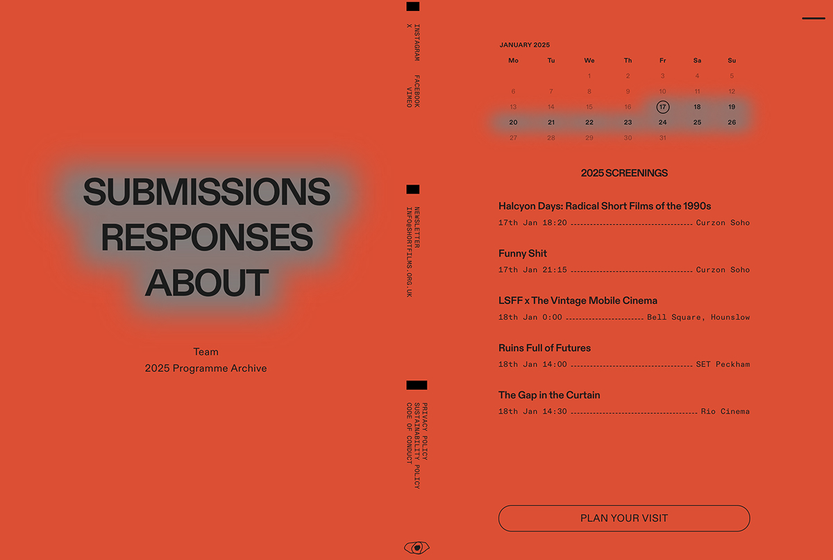
The London Short Film Festival site uses bold minimalism and artistic energy to speak directly to filmmakers and designers. Set in Diatype and Diatype Mono, the oversized, all-caps type has a poster-like presence—confident, graphic, and direct. A grey-to-red gradient adds urgency, while the split-screen layout and surreal imagery nod to the diversity of films. With zine-like details and a restrained, editorial tone, the design is experimental, expressive, and refreshingly unapologetic.
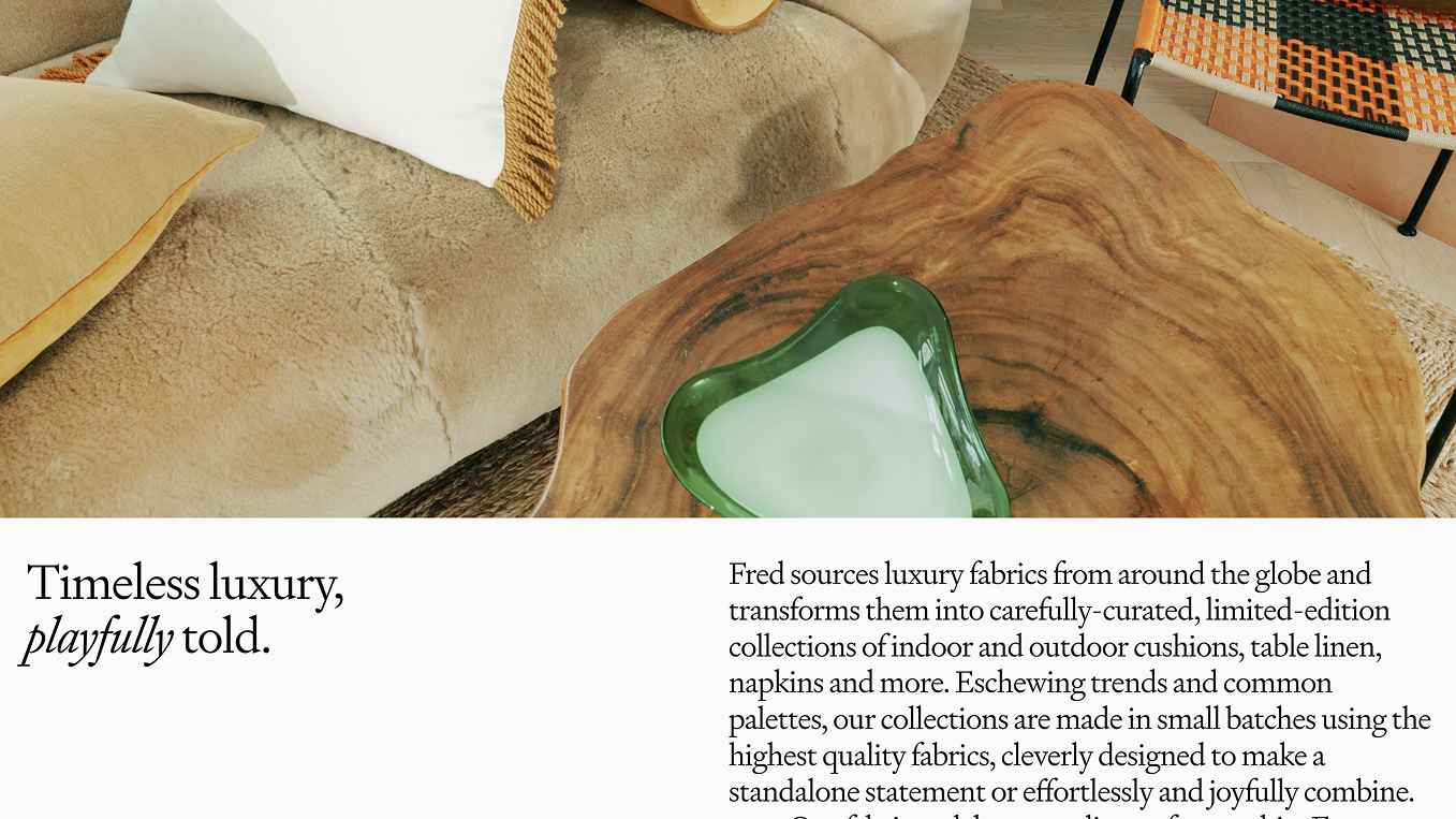
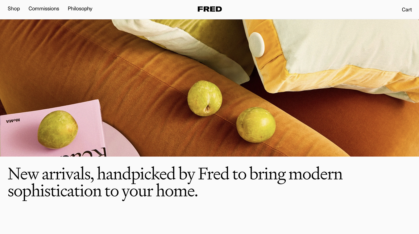
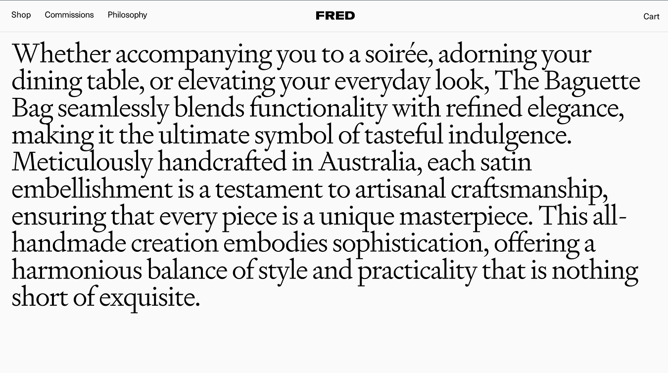
Fred
FONTS
Signifier, Neue Haas Unica
The FRED Home Philosophy page captures the essence of the brand—an Australian design studio creating furniture and objects with warmth, precision, and purpose. The site reflects this ethos with a refined, editorial feel that mirrors the care they put into their work. Using Signifier and Neue Haas Grotesk, the typography strikes a balance between sculptural elegance and modern clarity. The layout is clean and spacious, inviting readers to slow down and connect with the ideas behind the craft. It’s a thoughtful, restrained design that quietly echoes FRED’s commitment to considered, beautiful living.
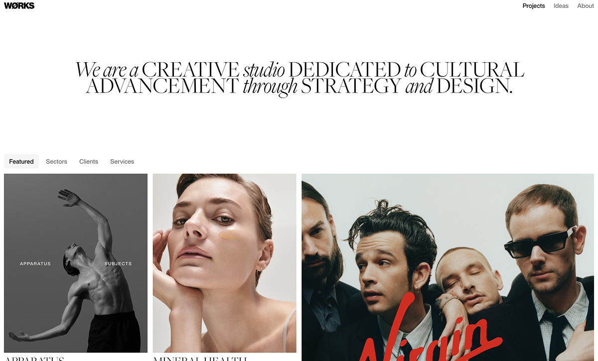
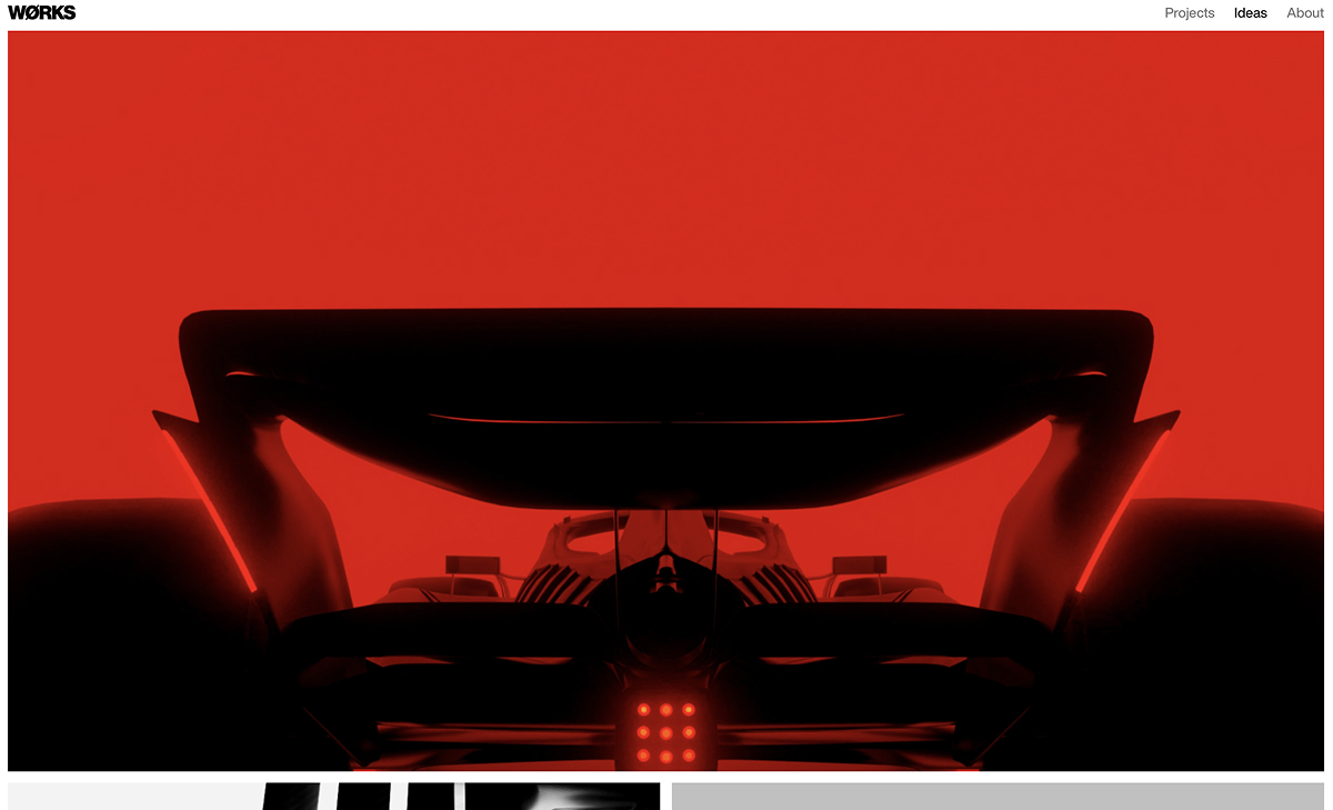
WØRKS
FONTS
Freight Big, Helvetica Now
Works Studio is a multidisciplinary design practice based in New York, known for building striking brand identities across art, fashion, and culture. Their site mirrors this ethos—bold, high-contrast, and confident without being overworked. The use of stark black and white, minimal typography, and abrupt transitions gives the experience a sharp, editorial edge. It feels like a design magazine that’s been distilled down to its most essential elements—fast, direct, and uncompromising.
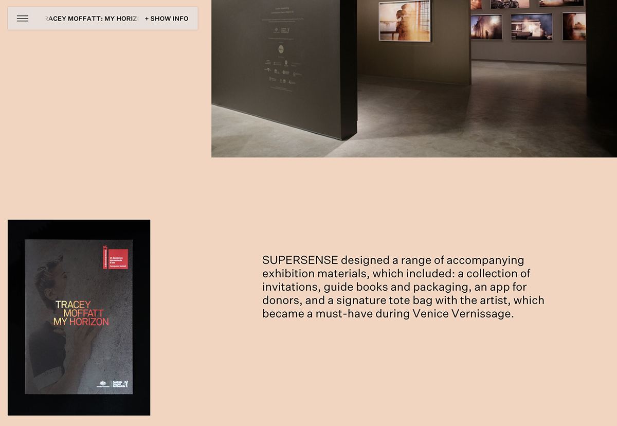
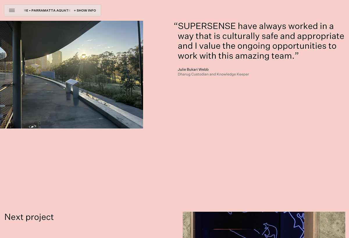
Supersense
FONTS
The SUPERSENSE website takes a calm, refined approach that feels both thoughtful and quietly confident—perfectly aligned with a studio rooted in cultural sensitivity and immersive experience design. The soft pink background sets a gentle, human tone while allowing the content—photography, quotes, and subtle interactions—to breathe. Typography is clean, modern, and minimal, creating a strong sense of space and rhythm. The layout feels open and deliberate, giving equal respect to image and text. Nothing is rushed. It invites you to slow down, observe, and absorb. Overall, it’s understated but elegant—design that leads with care, craft, and clarity.